However, for such recently published books, the Twilight series seems to have been published in more editions than the Bible. My assumption is that the publishers have seen an opportunity to get people to continually re-buy the same books, just so they can have every possible edition of their beloved story*.
First, we had the standard-issue hardcovers/softcovers, with the iconic covers:


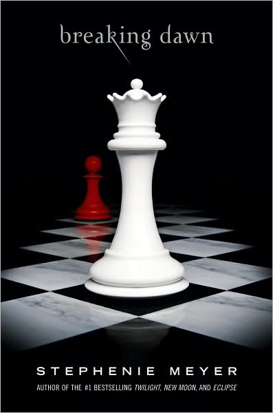
Simple, direct, and not bad, particularly when compared to what was inside...
Next up, we had the same covers, but with 'Special Edition' plastered across the top of each:
 The main difference with the Special Editions was that they had either the first chapter of the next book or - in the case of the copy of Twilight I read - a chunk of an apparently forthcoming version of the story told from Edward's point of view.
I'll give you all a moment to absorb the ramifications of that...
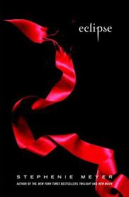
Next, and quite remarkably, we had the red-edged versions. Again, same covers, but the pages' edges (top, sides & bottoms) have been coloured red through some miracle technology:
 It's worth noting that, for a while, the top ten books sold in Australia each week included both the standard paperbacks of the series and the red-edged editions. There were certainly quite a few weeks where different versions of these four books made up 70 or 80% of the top ten books sold in Australia. (I believe the other two were Dan Brown's latest and whatever thing James Patterson had most-recently signed his name to.)
There was, of course, also box-set releases of all of these editions once all four books had been published, collecting previously released books into a piece of flimsy cardboard.
By this point, of course, the movie versions were beginning to roll out. And if movie adaptations of popular books exist, can movie tie-in editions be far behind?
No.


What's interesting about these editions - other than how bland the covers are, even by movie tie-in edition standards - is how relatively uncommon they were. The standard/special/red-edged editions of each book continued to be much prominently displayed in bookstores

and these tie-ins seem to have been released mostly to capture the re-buy market. They also came, as you might have noticed, with an Exclusive Poster Inside!, further implying that they were seen as a collectors' item, rather than as a normal way to buy the books. (Breaking Dawn is yet to come, of course.)
(By the way, that photo of a pile of Eclipses was taken by yours truly on his phone at Dymocks in Broadway back in February this year.)
At some point, I also noticed this little boxset release:
 A set of journals, with blank pages inside the four book covers, all in a neat package. Presumably so that fans could write their own swooning fanfic. (On that note: Stephenie Meyer may be the first person to write her own fanfic. Also, how great would it be to read any of my genre revisitations of Breaking Dawn in one of those notebooks?)
But the latest editions - and the inspiration for this post - are possibly the strangest:


How awful do those look? Breaking Dawn in particular has been completely ruined, but they're all vastly inferior to the original black versions. (Although, I do give them a little credit for the choice to remove all text from the front cover. That works well here, because the existing images are so well-known.)
Speaking of ruining things, other publishers also tried to capitalise on the Twi-session sweeping the world, with this remarkable piece of horror:

Clearly, the only way to shift a few copies of Emily Bronte's little-known and mostly-forgotten novel Wuthering Heights was to do a cheap knock-off of the Twilight books & plaster 'Bella & Edward's Favourite Book' across the cover.
On that cheery note...
* Full disclosure: there are several books which I own in multiple editions, simply because I liked a re-release. Penguin in particular are very good at repackaging their catalogue in irresistible new editions. So I understand the psychology, to an extent. But I would point out that, while I've done this for a handful of books, they're all approximately 800 millions times better, in both content & design, than Twilight.
I enjoyed your post, even if it did bring into the realm of my consciousness those awful Wuthering Heights editions... I am truly appalled by the implications of this, given I seem to recall that one of the Twilight disasters was "based on"/shamelessly referenced an Austen. I don't think I could bear a Twilightened version of Jane.
ReplyDeleteIn other news, how awkward does whats-her-name look on the cover of the movie tie-in New Moon?
Yeah, New Moon is the worst of the movie tie-ins (so far!), but I think the unfortunate-looking Kristen Stewart is only the second-worst thing about that cover.
ReplyDeleteThe worst is the horrendous Edward face behind the two of them: you can tell the thought process that went into that decision:
1. Oh, we need Robert Pattinson on the cover! He's the star. (Even if his character is barely in the book.)
2. Let's make him loom behind Bella & Jacob! You know, like his character looms over everything they do! It's symbolism, just like Ms Meyer taught us!
Thus endeth the creative process...